Exhibit 2
- Whitney Drollette
- Oct 1, 2019
- 2 min read

Updated: Nov 6, 2019
Task:
For this week's portfolio assignment, it's your choice ...
Idea :
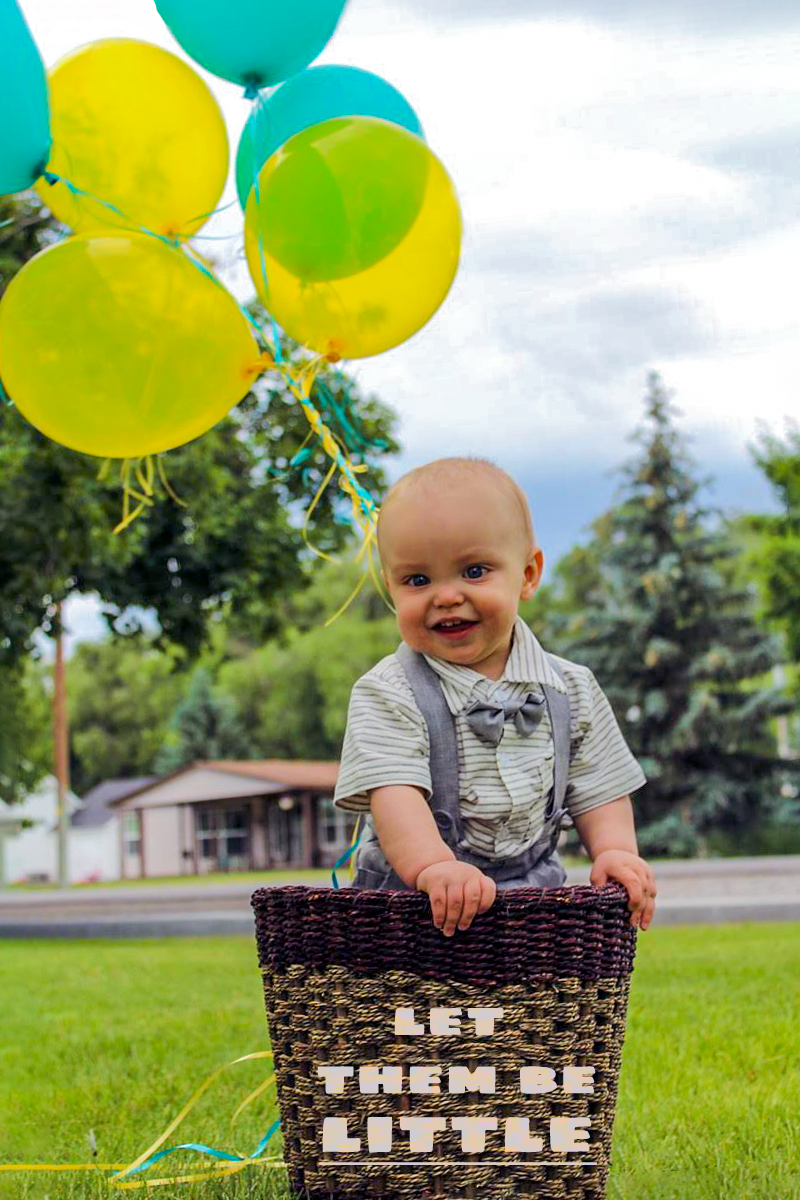
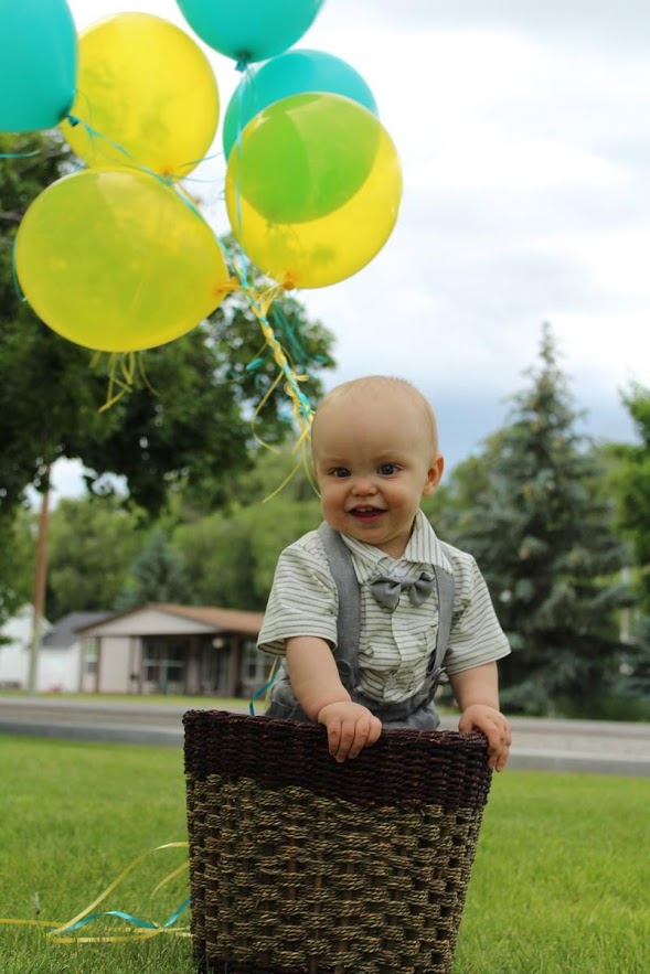
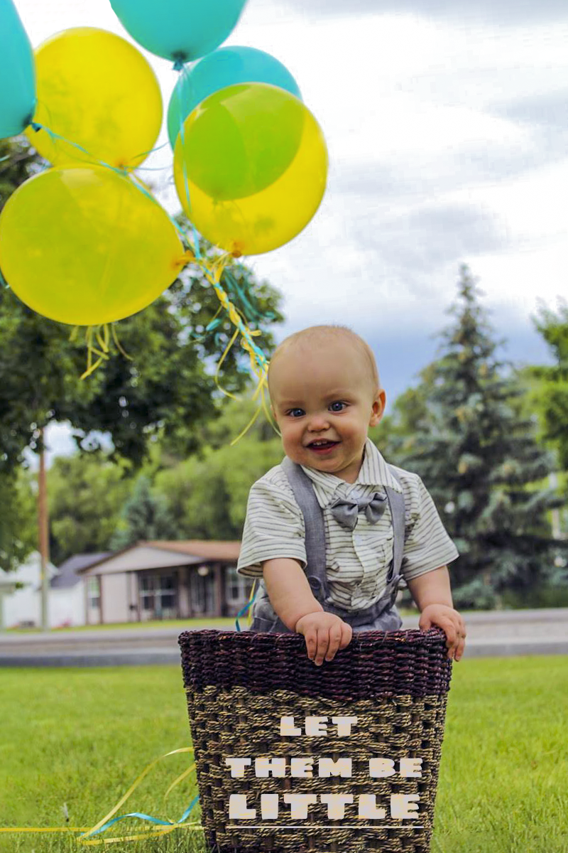
I've had this photo for a while, and it always slightly bugged me that the basket wasn't flush with the ground, and the coloring was a bit weird. A friend of mine took it for practice with her new photography business.
Process:
I first opened the picture up in Camera Raw and tweaked the exposure, contrast, shadows, and highlights until there were no missing white pixels. From there I upped the vibrancy a bit and opened it into Photoshop. There, I used the 'Crop - Straighten' tool to make the basket flush with the image and played around with the colors and tones a bit more.
Design
Contrast: Contrast wise, I think by bringing in the lost white pixels I gained lots of details within the clouds, my son's face, the highlights and coloring on the balloons, and just brought a lot more depth to the photo.
Repetition: Repetition wise, there's not a lot of bold aspects of repetition through this photo. The main one would probably have to be how the text is horizontally aligned with the horizontal line of the basket.
Alignment: The alignment of the basket lip to the photograph in general makes it seem more cohesive and put together.
Proximity: I honestly wish there was more photograph on the left side of this image. To add some empty space and really draw your eye to my son. I played around with the 'Crop - Straighten' tool to try and get more space on the left, but I wasn't able to make it look realistic.
Typography: I used Sigmar One for the text on the basket. I thought about not adding any type and just editing the photograph itself, but figured it could be fun to play with the typography element of Photoshop.
Credits
Before and After:


Comments